
Here’s some basic tips to designing successful Ads for those who are using publisher that have Adsense on thier websites. Read on to increase your Adsense hits!
Which ad format should I use?
As a rule of thumb, wider ad formats tend to outperform their taller counterparts, due to their reader-friendly format. Readers absorb information in thought units (that is, several words at a time). The wider format lets them comfortably read more text at a glance without having to skip a line and return to the left margin every few words as they would be forced to do with a narrower ad. The wider ad format also lessens the likelihood of readers leaving the ad unit altogether. Since these formats allow users to read more text without having to skip a line every few words, users’ eyes have less chance to leave the ad unit altogether. If positioned well, these ad formats can increase your earnings. The formats we’ve found to be the most effective are the 336×280 large rectangle, the 300×250 inline rectangle, and the 160×600 wide skyscraper. Keep in mind that while these ad formats typically perform well, you should use the format that best complements your pages.Tip for making the most of a little ad space: Try one of our streamlined link unit formats, shown below, or a referral unit. These formats are lean, mean, and versatile enough to fit in locations normal ads don’t.

Image ads increase variety and competition
By choosing to display image ads in addition to text ads, you can help ensure that you’ll have all available advertisers bidding to appear on your site. Both text and image ads will compete in the same auction to display on your pages, and we’ll automatically display the ad(s) that will be most effective for you on your site.Interested in giving image ads a try? Make sure your Ad Type Preference, under the My Account tab, is set to ‘Display text and image ads in all ad units.’ Then, test the image ad option on a small subset of your pages for at least 2 weeks and track the progress using channels. This will allow you see whether image ads are effective for you. More data means that you can make educated decisions about your site. Try image ads and see the results for yourself.

Tip for image displaying image ads: Make sure you’re using an ad format that supports image ads to take advantage of the full ad inventory for your site. You can find a list of the image ad formats here.
What color palettes are the most successful?
If you want the biggest revenue impact for the smallest effort, we recommend optimizing your color palettes. Choosing the right palettes can mean the difference between ads your users will notice — and click — and ads they’ll skip right over.We’ve outlined a few strategies below that are designed to decrease ad blindness, the tendency for users to ignore anything that’s separate from the main content of your site. By making these changes, you’ll be making your ads more visible to users. The goal isn’t to confuse users into thinking ads are content, but to get users to see and read the ads so they can click on those that interest them.
The color strategy you should use on your site varies depending on the ad placement and the color of the background where the ads are placed. Review the table below for a quick reference about which strategies we suggest will work well on your site.
| Ads within content | Ads adjacent to content | |
| Light background behind ads | Blend | Blend or complement |
| Dark background behind ads | Blend, complement, or contrast | Contrast or complement |
Let’s briefly define the three techniques you can use to design color palettes that will be successful for your site:
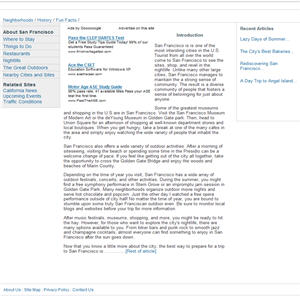
- To blend, make the background and borders of your ads the same color as the background of your page where the ad is placed. If your site has a white background and you don’t want to spend a lot of time choosing ad colors, we recommend using our pre-designed Open Air palette.
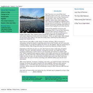
- To complement, use colors that already exist on your site, but don’t match the background and borders exactly where the ads are placed.
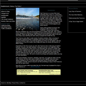
- To contrast, choose colors that stand out against the background of your site. Contrasting is recommended only for sites with dark background, so we suggest using a palette with white background, white borders, and blue titles.
| Blend | Complement | Contrast |
|
|
|
For most color techniques, we recommend using colors for your ad text and links that already exist on your site. For example, if the links on your site are all green and your text is black, use green links and black text in your ads as well. Since most users are accustomed to seeing blue links, you might also try using blue.
In general, use common sense when choosing your color palettes. If your site’s main colors are pastels, don’t design ads that are all primary colors. Users won’t click on ads that are visually offensive.
Even if your ads are designed perfectly, the techniques above might not work for a couple reasons:
- Does your site have mainly repeat visitors?
If your visitors come back day after day, they’ll likely become blinded to the position of the ads over time, regardless of the ad colors. Try rotating colors or occasionally switching the location of your ads on the page. - Does your site have a lot of ads and busy content?
If your site is filled with ads or packed with loads of competing content, chances are that you’ll need to use more visually arresting colors to make your ads catch a user’s eye. If the techniques above aren’t getting results for you, try using more prominent palettes
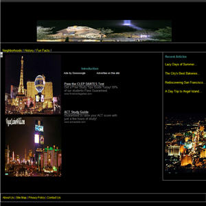
Tip for making your ads visible: open your page and give it a quick glance, putting yourself in the mindset of a regular user. Do the ads draw your attention, without being garish? Would you be likely to notice and read them, or do your eyes glide right past them? Try to find a balance between ads that overwhelm your content and ads that your users won’t even see. Imagining you’re a user, look at the examples below. Would you notice the ads in these implementations?
|

|
Tip for testing color palettes: add variety and freshness to your ads by rotating between several color palettes. All you need to do is choose the Use multiple palettes option when generating your ad code during the Choose Ad Format and Colors step in the ad code setup, then hold down the Control or Command key and select up to four color palettes.
Source : Google Adsense Optimisation Tips
[tags]Adsense, Optimisations, Tips, SEO, Design[/tags]